Real Madrid's Green Robe Takes 3rd, While the No. 1 Hides Half a Century of Romance
2026-08-04 06:55 · Leyi Kanqiu
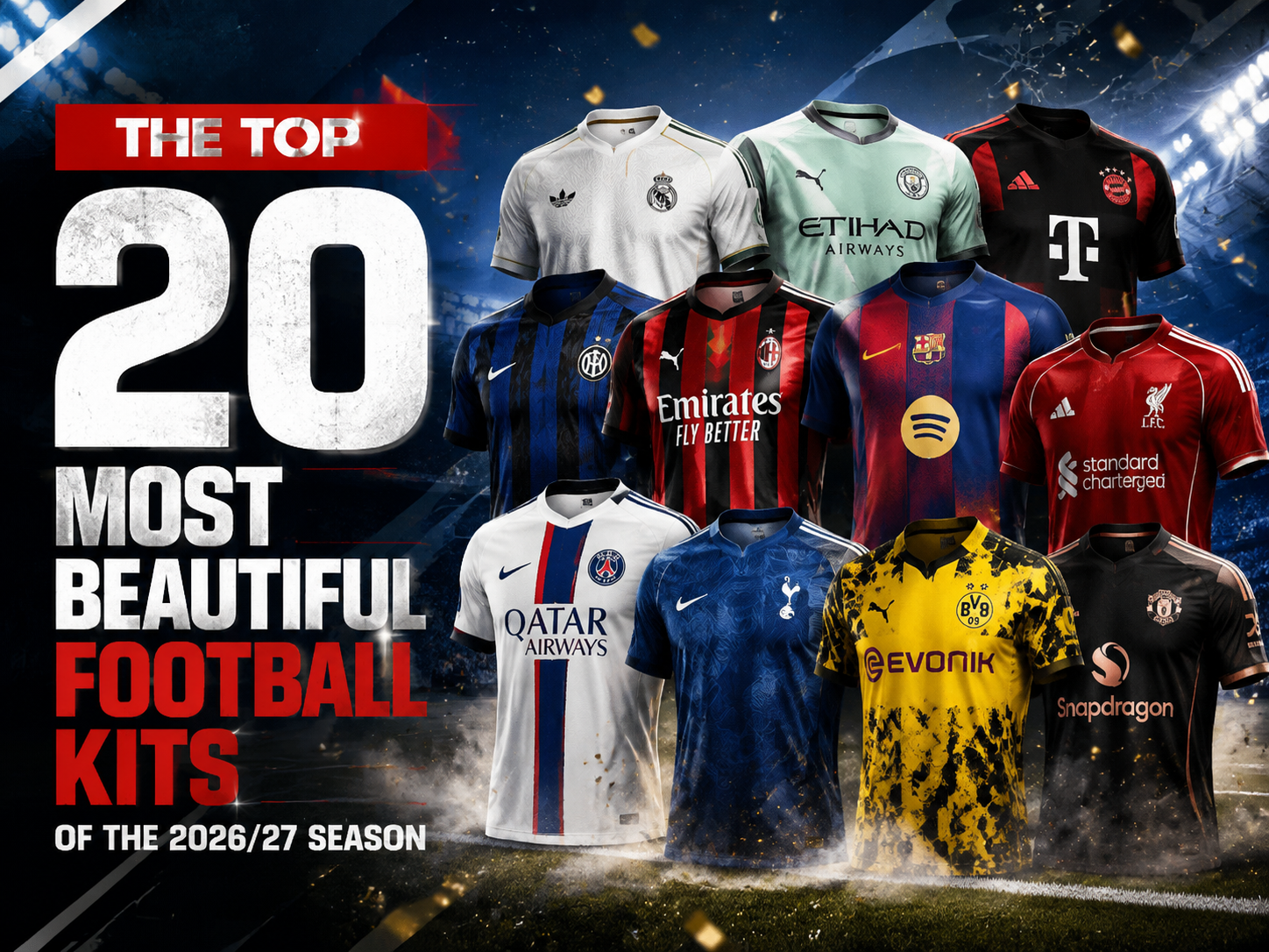
This season's designs have been exceptionally competitive: retro revivals have taken on fresh forms, city collaborations have become deeply personal, and inspirations have even been drawn from music, architecture, and mythology. We combed through all the new kits from top-tier leagues to select 20 that balance aesthetic beauty with rich storytelling—making them not only look great on the pitch, but also completely wearable for daily street style.
20th–11th: Niche Clubs Deliver Surprises with Heartfelt Details
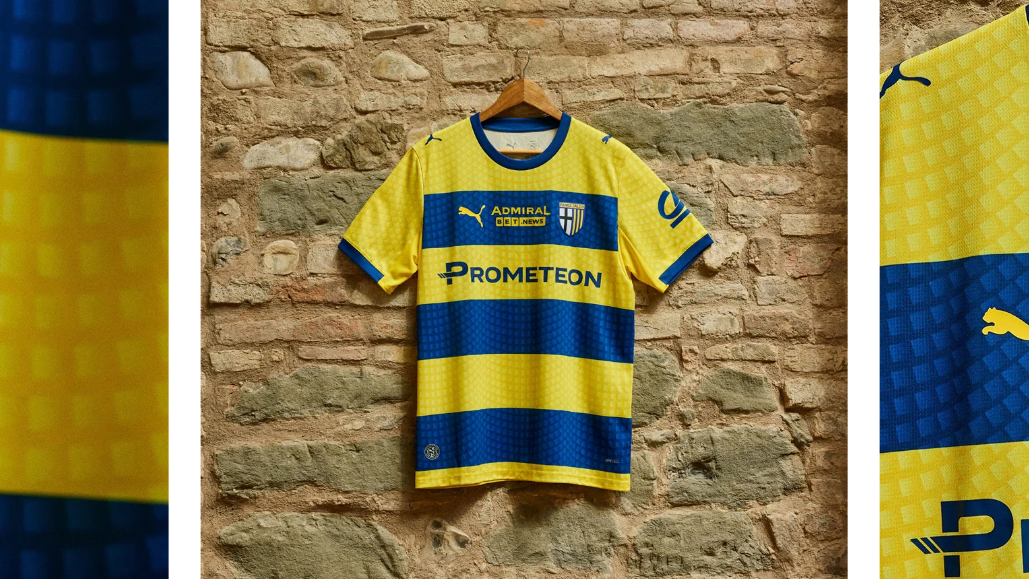
Puma’s retro aesthetics never disappoint. This away kit builds on the concept of "city shaping," printing the cobblestone texture of Parma's central Piazza Garibaldi directly onto the fabric. Featuring the classic yellow and blue horizontal stripes with a collar design, the back of the neck is stamped with the club’s founding year, "1913." It pays homage to urban cultural heritage while echoing Parma's status as the "European Youth Capital" for 2027—making it both vintage and commemorative.
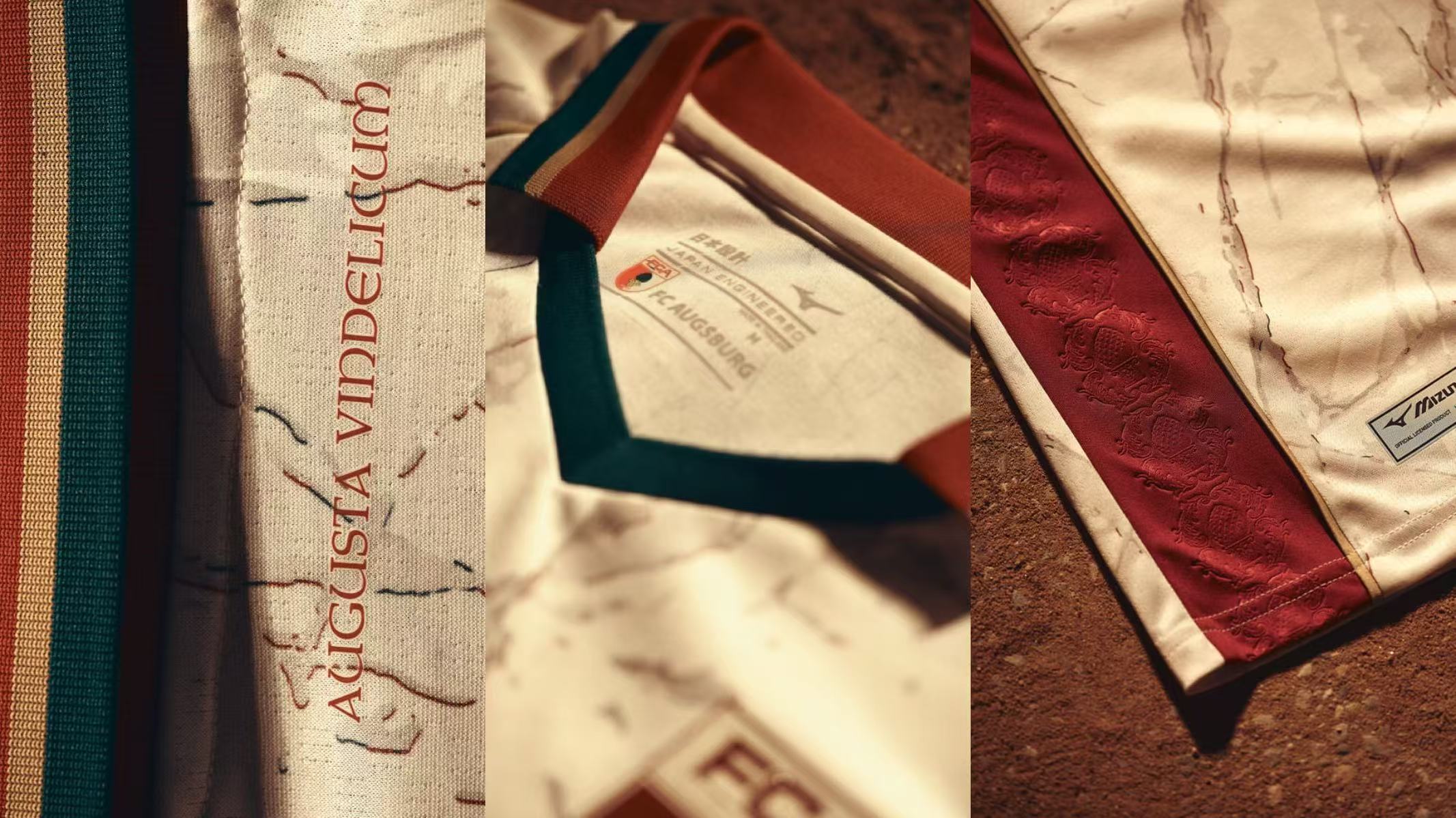
Mizuno brought ancient Roman marble directly onto FC Augsburg’s home kit. The jersey draws inspiration from the city's Roman history—Augsburg, formerly known as Augusta Vindelicorum, was a major stronghold during the Roman Empire. The fabric features a built-in marble texture, complemented by gold details on the collar and cuffs, and subtle Roman pinecone relief patterns on the sides, maximizing its historical weight.
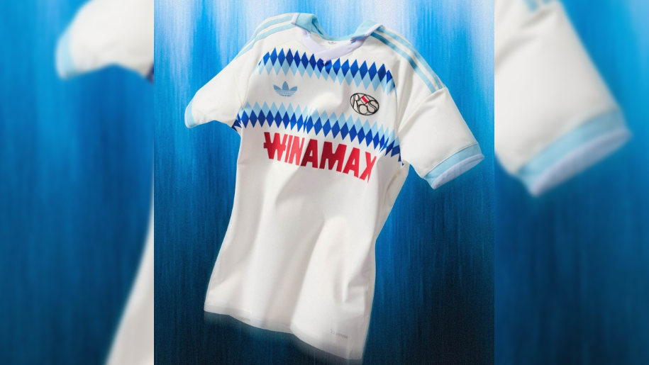
Adidas teamed up with Strasbourg to bring 1990s football fashion back to the pitch. The main body features deep and light blue horizontal bands filled with diamond-shaped jacquard patterns, exuding a strong retro vibe. The most sentimental touch is the crest: it adopts the club's first circular badge used between 1920 and 1945, bringing a century of heavy historical presence to the surface.
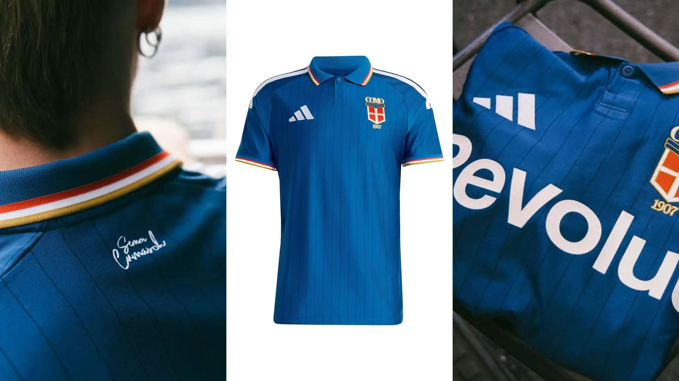
From a distance, it looks like an Italy national team kit, but up close, it reveals itself as the home kit for Serie B side Como. Classic sky-blue base, fine vertical stripes, white shoulder piping, and a polo collar, the collar and cuffs are accented with red, white, and gold. The inner collar is printed with the local dialect phrase "We are the people of Como." The launch method was equally special: instead of players, it was first modeled by Como Lake restaurant staff and ferry workers, proving that a jersey is not just a uniform, but an everyday symbol of the city.
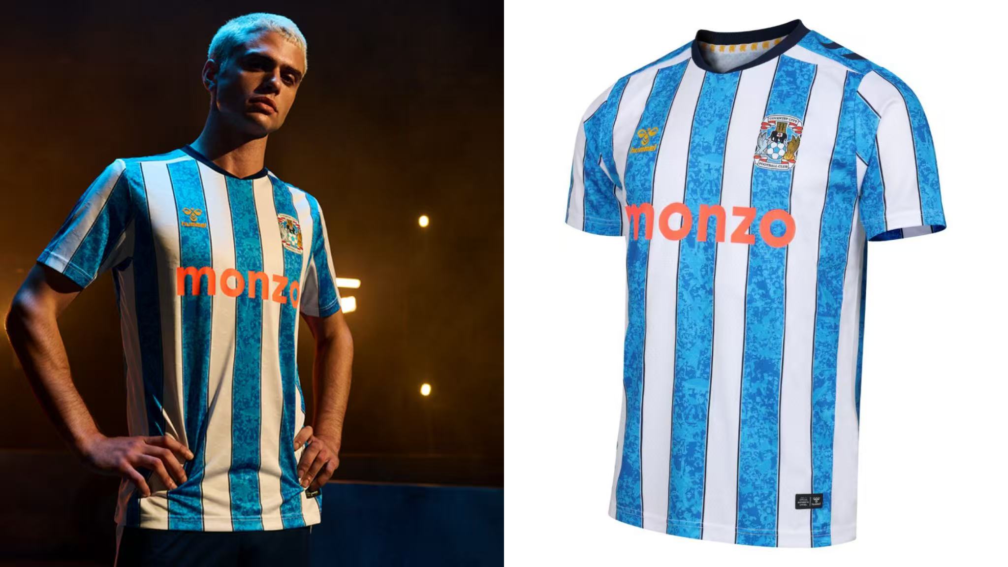
Fans argued fiercely after this kit was released, with some claiming it resembles Huddersfield, but stripped of controversy and judged on design alone, it is an absolute ceiling of aesthetics. The design honors the 1987 FA Cup-winning squad, using a sky-blue base with white vertical stripes sandwiching fine navy lines to perfectly replicate the classic layout of that era. The launch event played heavily into "Motor City" nostalgia—Coventry was once the "Detroit of England," and its automotive industrial genes are as deeply carved into the city as its footballing roots.
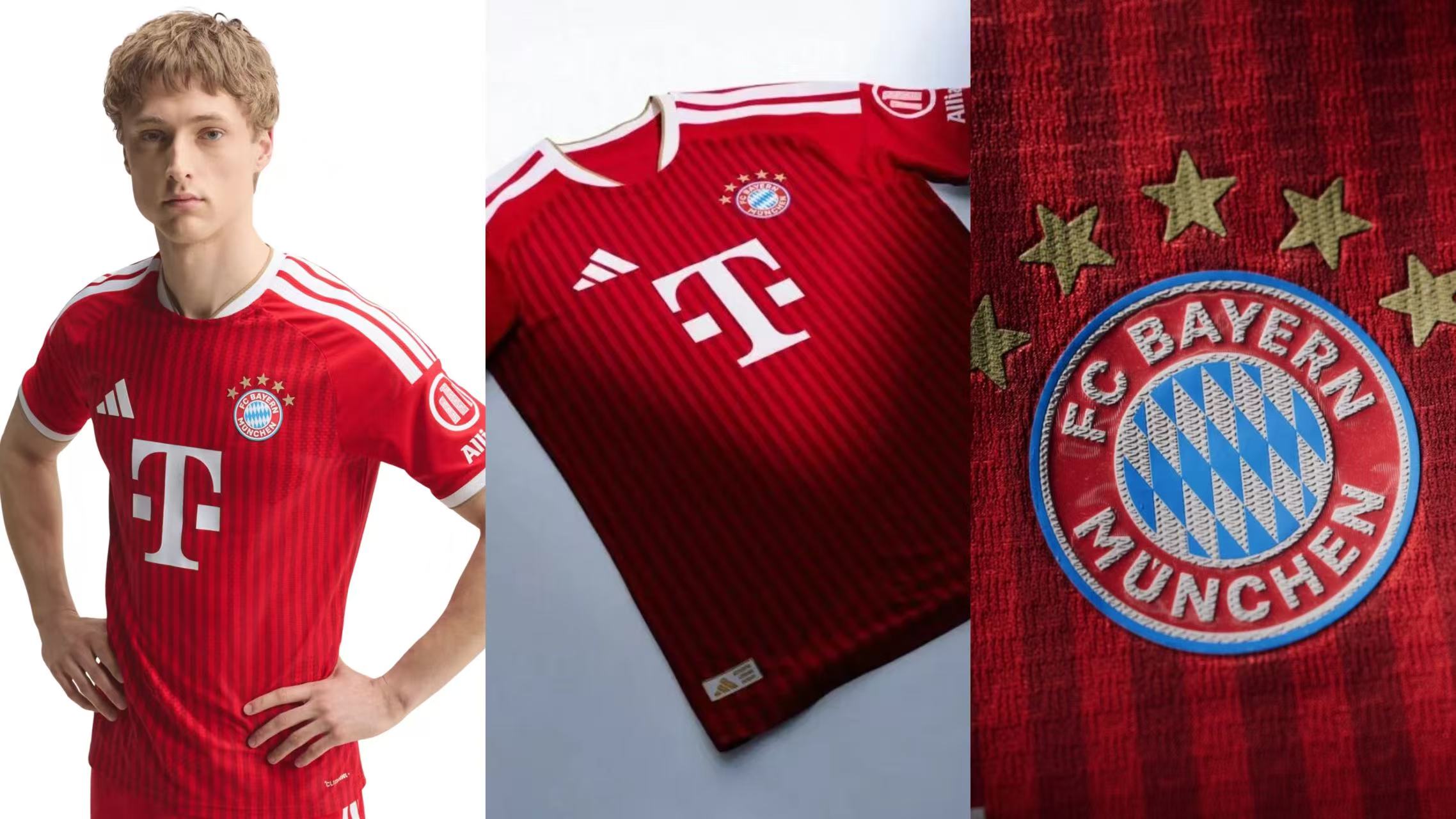
Bayern’s home kit perfectly interprets "low-key luxury." The team actually debuted it early during the Champions League semi-finals against Paris. Traditional Bayern red is paired with a tonal jacquard pattern, while the collar and cuffs are trimmed with gold, and the crest and brand logo are rendered in white. The last time Bayern used gold elements on a home kit was the 2011/12 season, making this a 15-year retro comeback that maximizes texture.
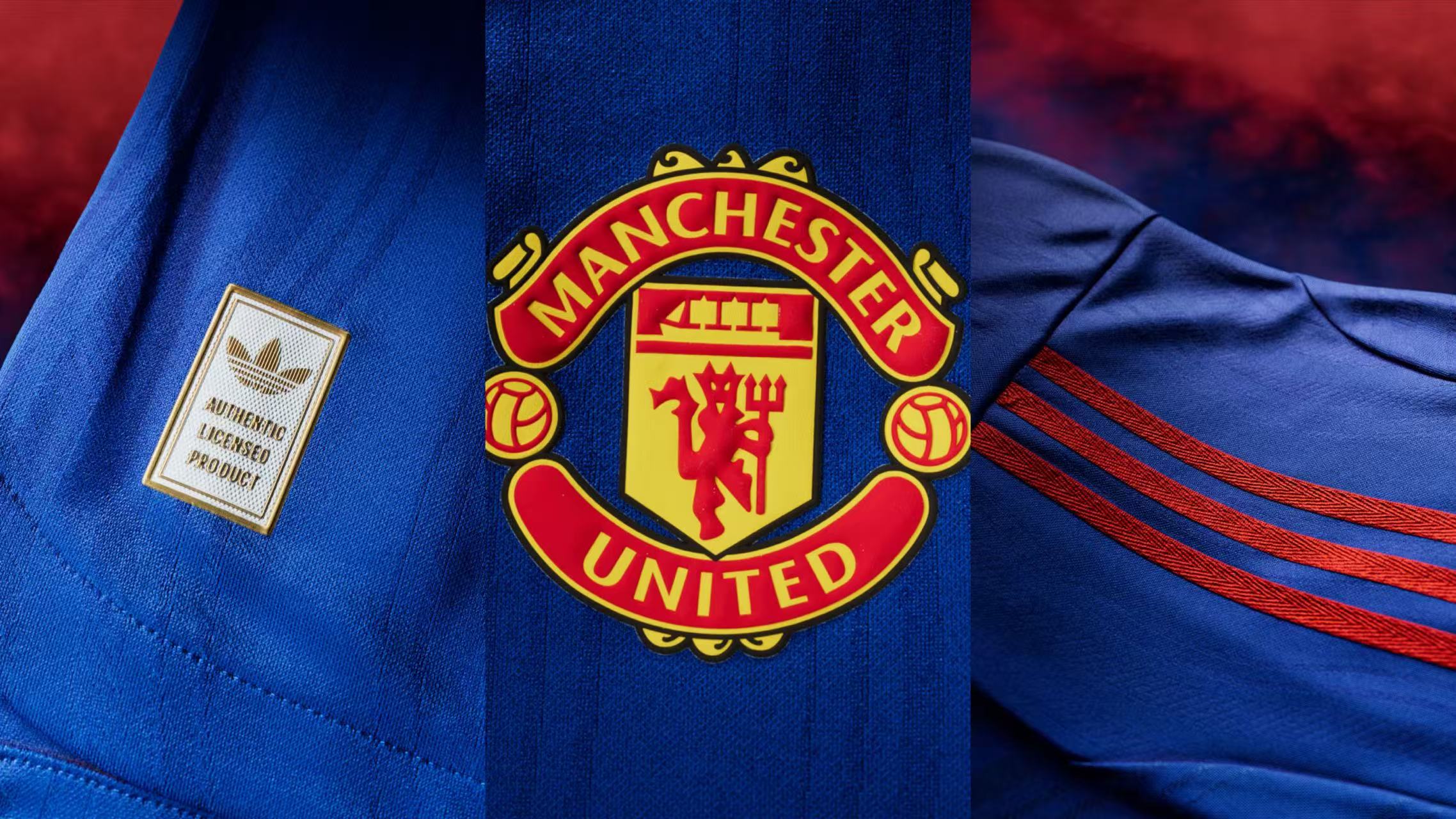
This kit made its first public appearance at the US World Cup final, where it was styled by rapper Stormzy. The design pays tribute to the classic 1988 away kit while incorporating imagery of Manchester’s mother river, the River Irwell. A deep royal blue base paired with delicate tonal patterns creates an understated elegance with zero flashy graphics, making it effortless for casual daily wear.
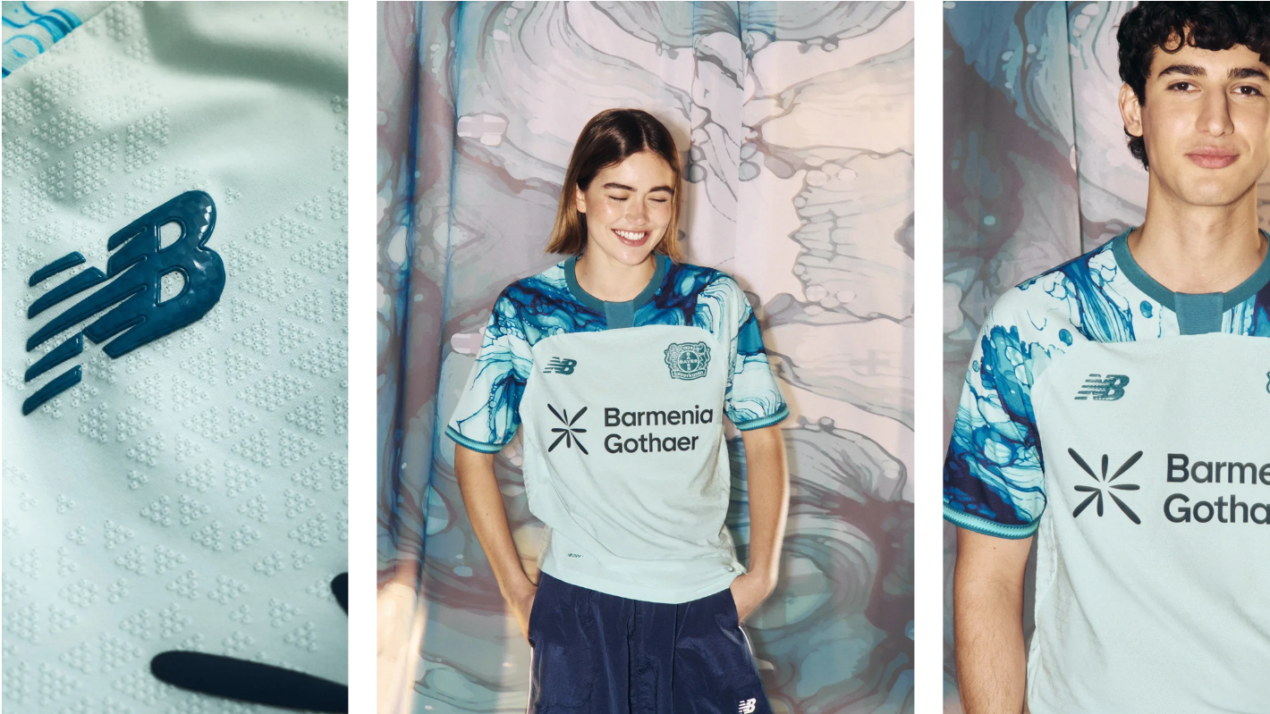
New Balance baked "chemical reactions" directly into the jersey. Leverkusen is nicknamed the "City of Colors," rooted in Bayer’s century-long history of dye research. The shoulders and sleeves of this away kit feature a marbled, tie-dye texture simulating a chemical reaction—a fresh concept tightly aligned with the city's DNA, offering a refreshing and memorable visual punch.
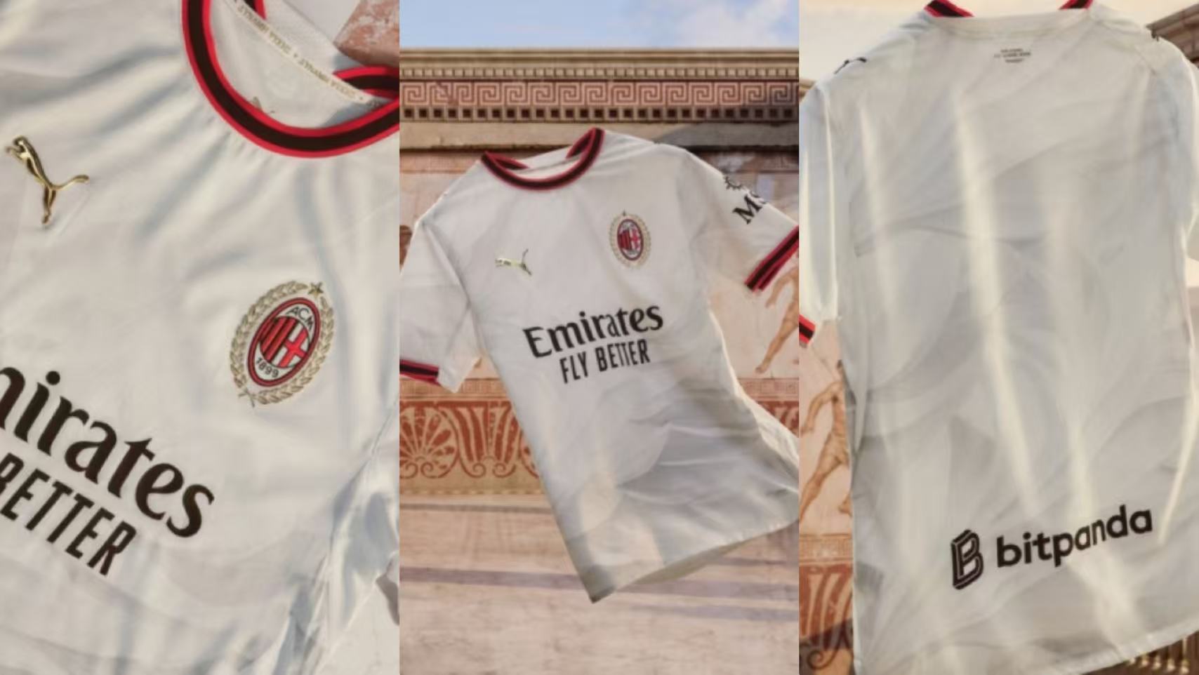
"After Istanbul, there is always Athens." This white away kit holds the hard-core spiritual core of the Rossoneri. The inner collar is printed with this famous quote alongside the Greek phrase for "Power of the Soul," paying homage to the heartbreak of the 2005 Istanbul night and the redemption of the 2007 Athens revenge. The phoenix wing pattern on the body symbolizes rebirth, while gold details honor San Siro’s centennial history, maximizing emotional resonance.
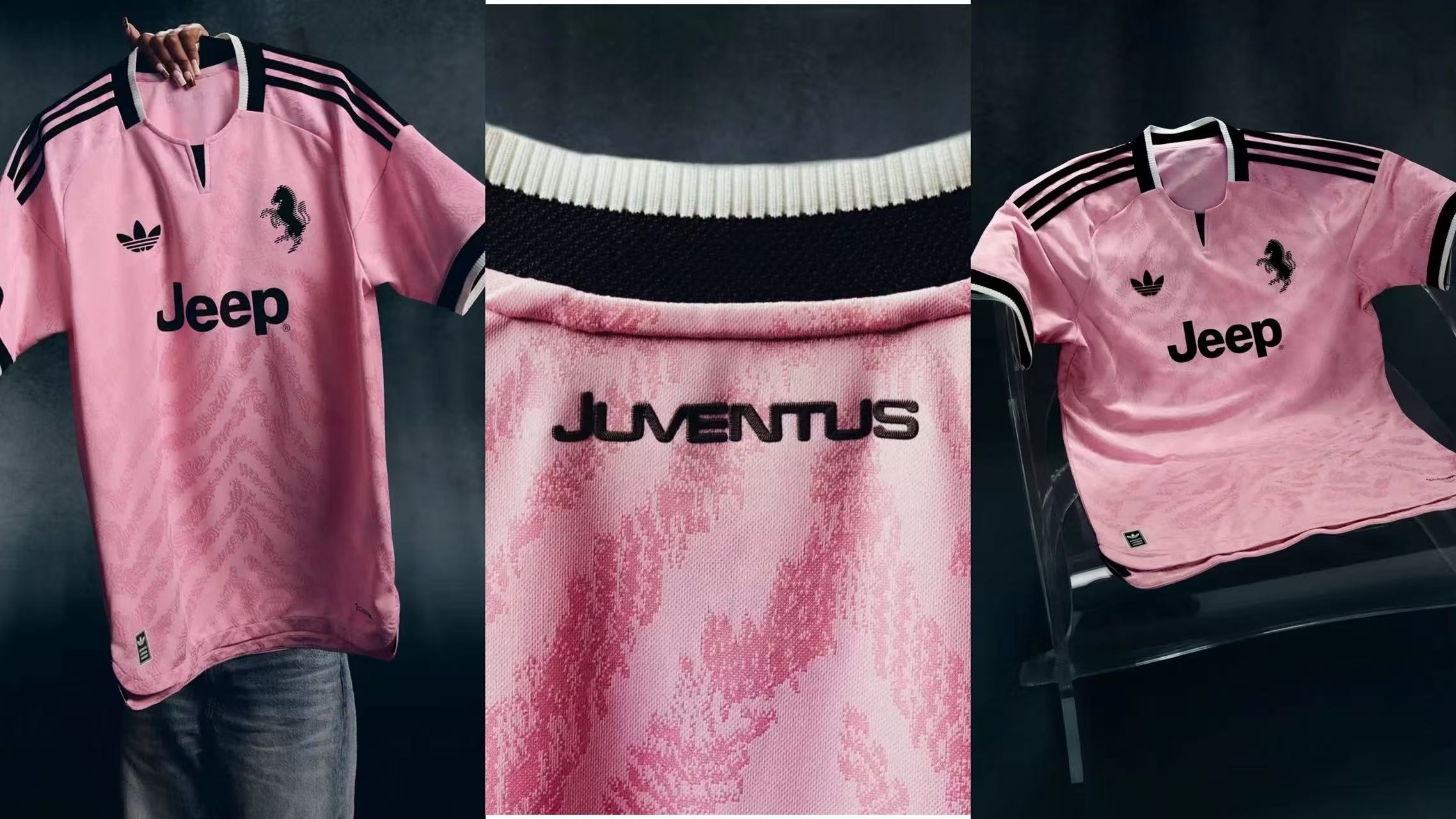
The "Old Lady" is back in pink. Pink was the home color Juventus wore in their founding days. This away kit uses a soft light-pink base paired with tonal zebra-stripe jacquard patterns, elevating classic zebra elements into high fashion. Striking the ideal balance between modern and vintage, it's a stylish look easily pulled off by both male and female fans.
10th–4th: Giants Step Up, Delivering Both Nostalgia and Design
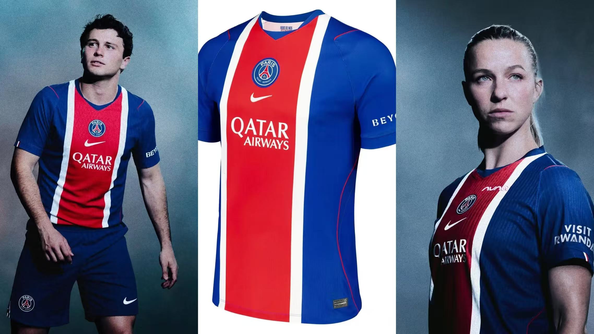
PSG's classic "Hechter stripe" has made a comeback. Crafted by former owner and fashion designer Daniel Hechter, this vertical stripe running down the jersey is PSG’s most recognizable symbol. The new home stripe draws inspiration from the waving flags in the stands of the Parc des Princes, symbolizing the deep bond between fans and the club—minimalist yet powerful.
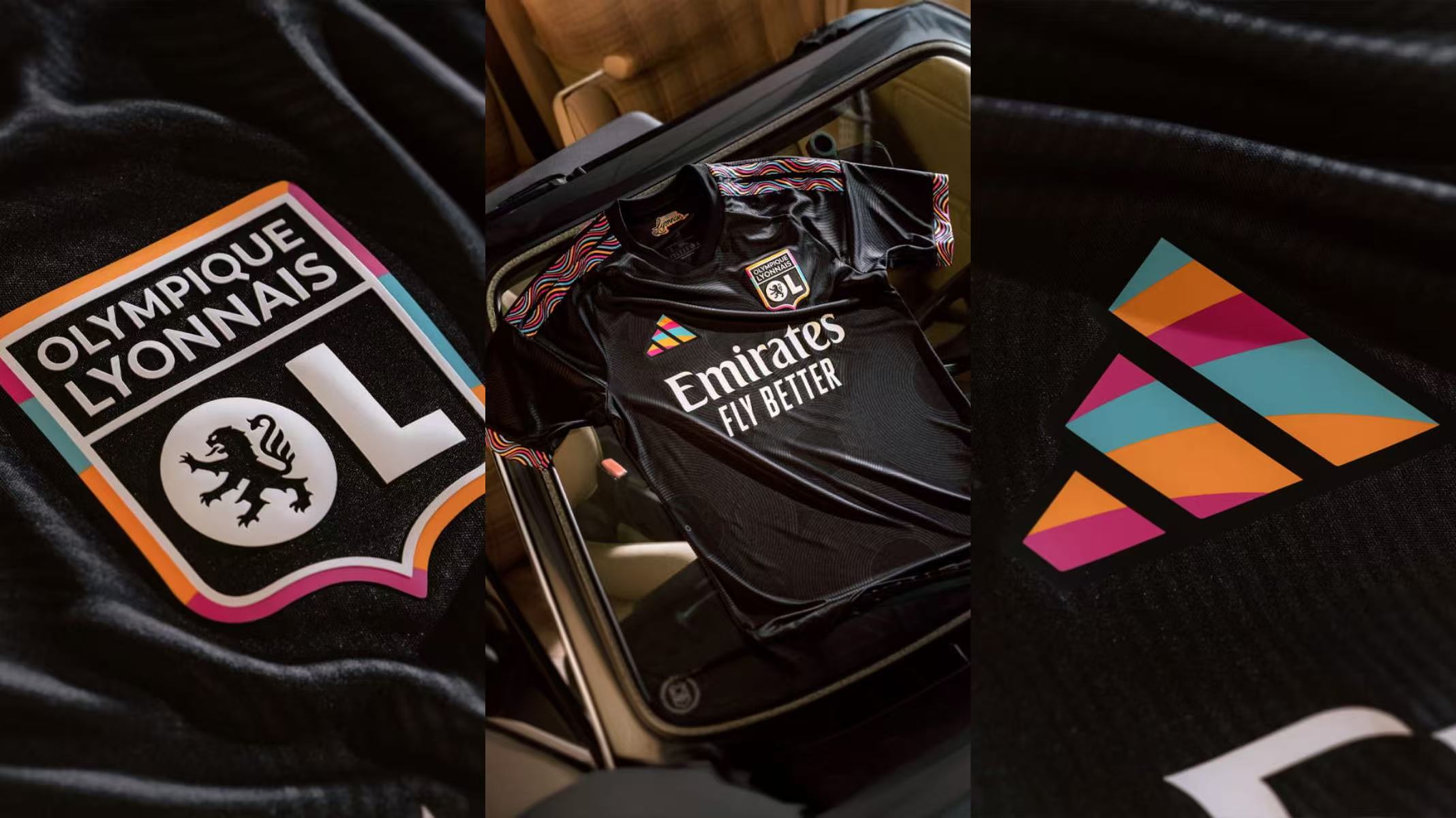
A rare third kit to make the list, but it thoroughly earns its spot. Lyon is known as France’s "Funk Capital," having steadfastly embraced funk music culture for over 40 years to forge a unique urban identity. This kit weaves vinyl records and soundwave textures directly into the fabric, even giving the Adidas logo a funk-style makeover. The black base corresponds to the psychedelic atmosphere of nightlife, turning up the cool factor.
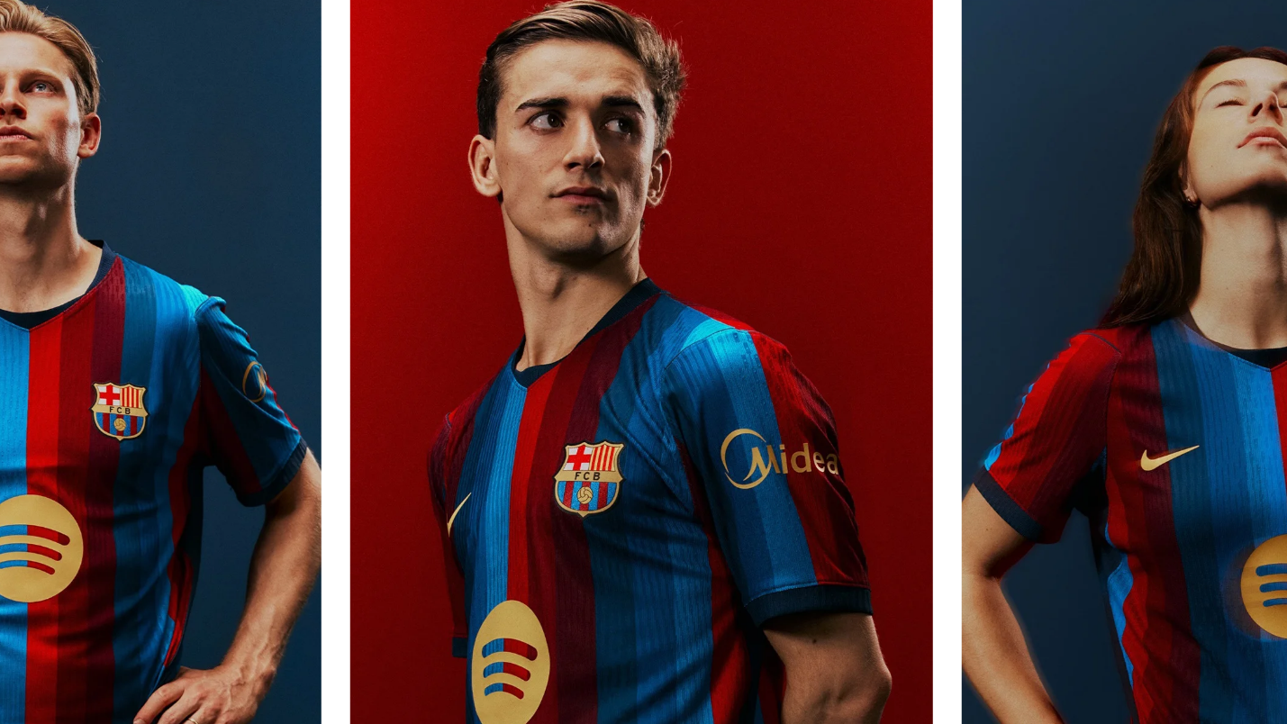
Nike and Barça’s collaboration has brought a fresh spin this time around. The classic red and blue vertical stripes pay homage to the legendary 2006/07 kit while incorporating a gradient effect that echoes the exterior facade of the newly renovated Spotify Camp Nou. Hexagonal necklines and navy cuff details are meticulously crafted, and even the font numbers draw inspiration from Catalan Modernist architecture, perfectly blending tradition with modernity.
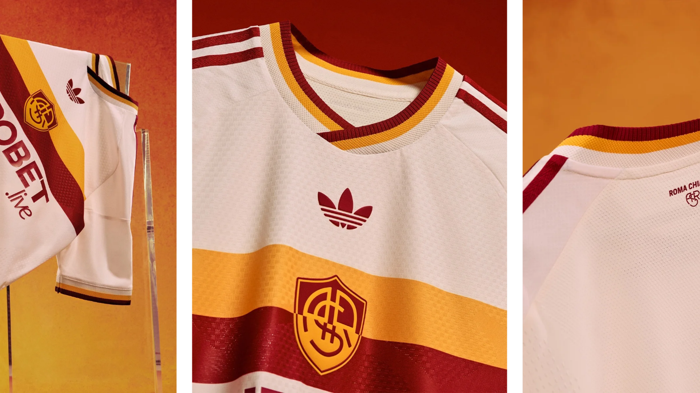
Though not yet revealed, leaked designs alone have already locked this in as a prime contender for kit of the season. The design theme centers on the ancient Roman virtue of Pietas—the core Roman trait symbolizing loyalty, honor, and responsibility. An ivory-white base is crossed by a red-and-yellow horizontal band across the chest, paired with the 1945–1949 retro crest and trefoil logo, radiating classical Roman elegance.
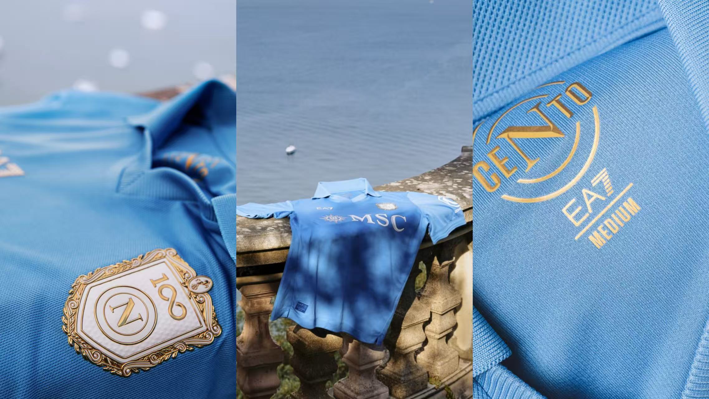
Celebrating its centenary, Napoli has literally worn its history on its sleeves. The home kit honors the club's 100-year history, featuring the "Sun Horse" motif—the club's first crest and an ancient symbol of the city of Napoli. Crafted by EA7, it retains the classic sky-blue while utilizing fabric textures reminiscent of 1980s wool jerseys, making it both retro and deeply commemorative.
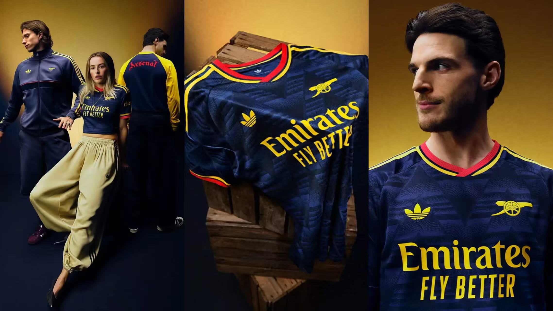
While there are plenty of retro replica kits out there, Arsenal's "Bruised Banana" truly captures the spirit of the classic design. Based on the legendary 1991–1993 away kit nicknamed for its unique yellow gradient pattern, the new version retains the iconic graphic layout while optimizing fit and fabric quality. Older fans will shed tears of nostalgia at first sight.
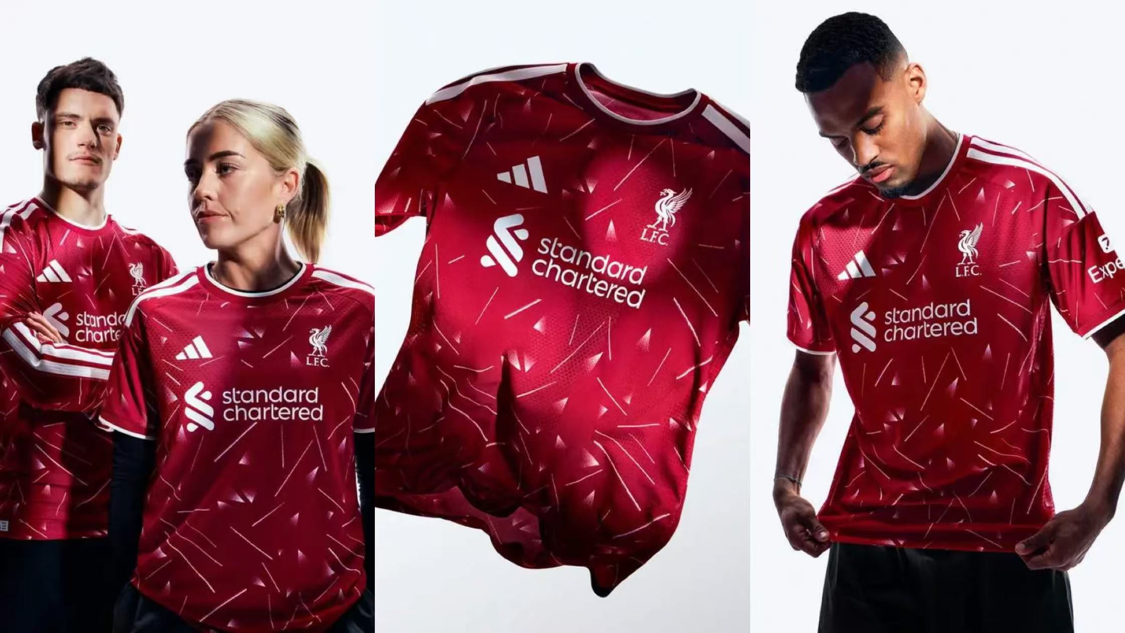
Iraola’s squad steps onto the pitch next season wearing the most classic jersey template in club history. The design honors the 1989–1991 season—the golden era under Kenny Dalglish and the final peak before Liverpool’s long championship drought. The kit features a deeper, richer "active burgundy" tone, possessing much more texture and vintage film-like character than traditional Red.
The Top 3: Aesthetic Perfection with Moving Stories Behind Every Thread
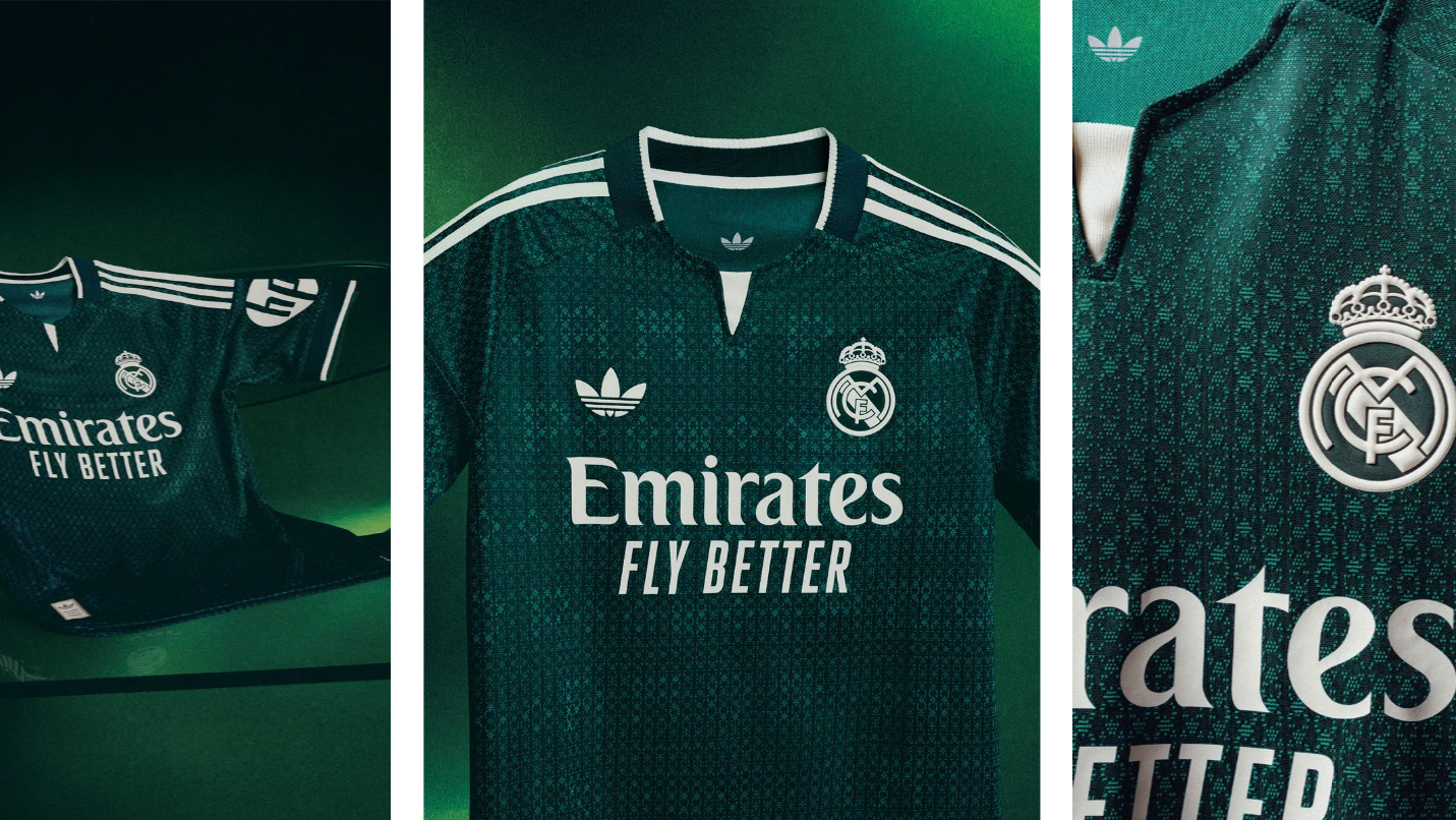
Adidas' away kits went all out this season, but Real Madrid's entry has elevated the game to new heights. Dubbed "Aurora Ivy Green," this rich, sophisticated green tone is covered in geometric jacquard patterns derived from the club crest, with hidden "RMCF" lettering woven all over the body. The last time Real Madrid wore a green away kit was during the 2012/13 season under José Mourinho. This return after a 14-year hiatus arrives wrapped in a legendary aura.
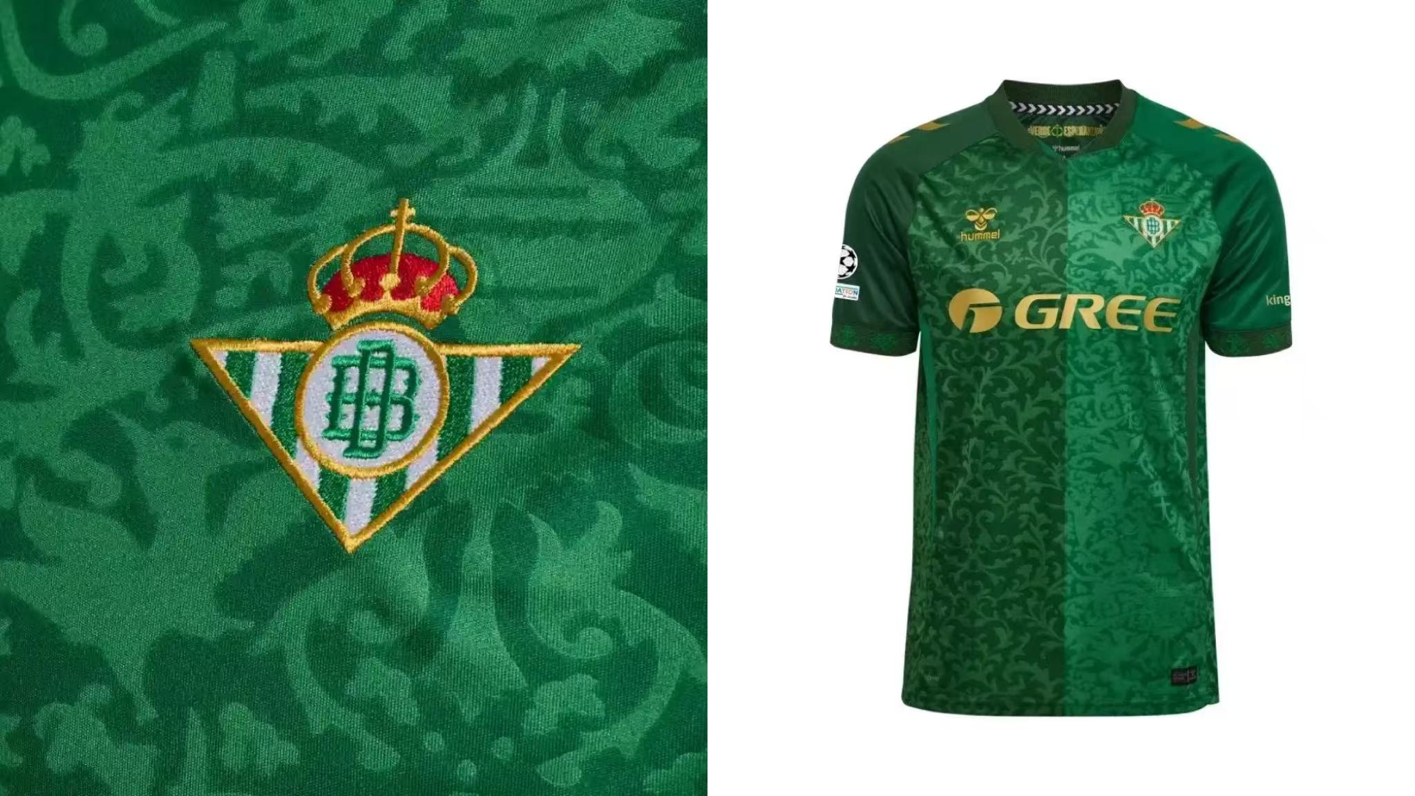
Another green jersey, this Hummel design for Betis has been hailed by fans as "the pinnacle of the brand's return." Two shades of green gradient intersect and blend, accented by a gold logo and delicate floral jacquard patterns spread across the fabric, echoing the club’s nickname, "Green of Hope." What makes it even more touching is the emotional warmth behind it: in the comments of the launch video, even fans of arch-rivals Sevilla left messages of respect. The kit also honors Sandra, a 14-year-old Betis female fan who tragically passed away due to school bullying, proving that football's warmth always transcends competition.
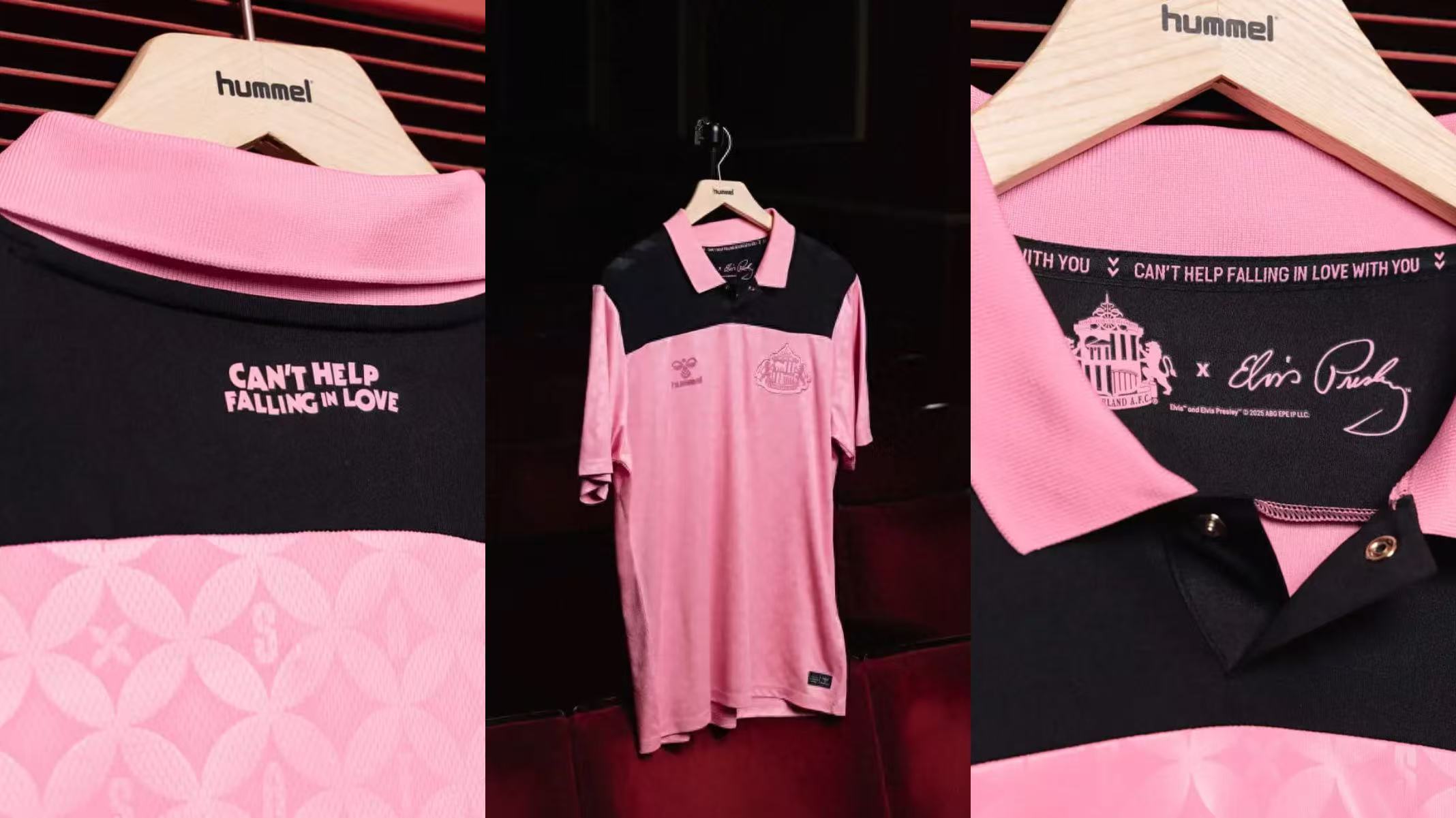
Why does an away kit from a non-giant club claim the top spot? Because it holds the most romantic connection in the footballing world. For decades, Sunderland fans have sung Elvis Presley’s "Can't Help Falling in Love" in the stands, a song that has long served as the club's beloved anthem. Next season, the club is directly partnering with the Elvis Presley Estate, drawing inspiration from the black-and-pink color palette of Elvis’s early performances to craft this pink away kit. Featuring a classic buttoned polo-collar, 1950s-style hidden patterns embedding the letters "SAFC," and the immortal lyrics printed inside the collar: "Can't Help Falling in Love with You." As Sunderland’s Commercial Director noted: "The connection between Sunderland and Elvis is a romance unique to football. For nearly half a century, this song has witnessed all our high-water marks and carries the deepest bond between the fans and the club."